deviant art

Deviant Login Shop  Join deviantART for FREE Take the Tour
[x]
Shop Similar Prints
This Print Not Available
more ▶

More from *Tigershark06

Featured in Groups:

Details

January 19
82.2 KB
802×544
Link
Thumb

Statistics

Comments: 36
Favourites: 5 [who?]

Views: 74 (0 today)
[x]
:icontigershark06:
EDIT 2-17-13: Took a lot of people's inputs and incorporated them into the image. I hope you guys like the improvements I've made.

Next favor to ask.

Which composition do you like better? The image on the Left or the Image on the right?

~~~~~~

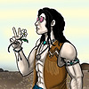
Well being that it's coming up on April and that's when I want to publish Brothers Martin: Forgotten Ties, I figured I'd better get off my duff and get the proposed cover finished.

So I am posting this here to get any feedback I can get on the effectiveness of the composition and colors on this proposed book cover.

So I am asking for feedback and critiques.

:D
Add a Comment:
 
love 0 0 joy 1 1 wow 0 0 mad 0 0 sad 1 1 fear 0 0 neutral 0 0
:iconshaharw:
The one on the right, definitely. 's looking good!
Reply
:icontigershark06:
*Tigershark06 Feb 18, 2013  Hobbyist Digital Artist
:D THank you for your input chica! Hope you're having a good day!
Reply
:iconkezhound:
~Kezhound Feb 17, 2013  Professional Digital Artist
I prefer the one on the right, but I think the font choice is not suited to a cover. Have you checked out all the fonts available at dafont or 1001freefonts?
Reply
:icontigershark06:
*Tigershark06 Feb 17, 2013  Hobbyist Digital Artist
What about the font doesn't look right...just the form of it, or??

I will try out a few more to see if something else looks better.

And thank you for the input!
Reply
:iconkezhound:
~Kezhound Feb 17, 2013  Professional Digital Artist
I also like the font fine as is for your name, just not as a title. Not sure how helpful that is though.
Reply
:icontigershark06:
*Tigershark06 Feb 17, 2013  Hobbyist Digital Artist
Okies! I appreciate the information!
Reply
:iconkezhound:
~Kezhound Feb 17, 2013  Professional Digital Artist
The font itself looks like one of the basics in the MS Word package. Perhaps there are just fonts that I personally think "fit" titles, and this one to me doesn't. It seems to lack that "Hey, check this out! I'm totally cool and worth it," factor. Might be because the eyes slide off it due to the cursive/curviness.
Reply
:icontigershark06:
*Tigershark06 Feb 17, 2013  Hobbyist Digital Artist
K, thanks for that additional information Kez!
Reply
:iconearthmanprime:
*EarthmanPrime Feb 17, 2013  Hobbyist General Artist
I will go with the one of the right. It really stands out, and the only thing I can think of to possibly make the one on the right stand out better would be to make the foreground a bit lighter in color. That's it. But even if you didn't it still holds up well.
Reply
:icontigershark06:
*Tigershark06 Feb 17, 2013  Hobbyist Digital Artist
Thank you for popping in and giving me your opinion (I like the one on the right too! :P)
Reply
Add a Comment: